CollegeChoice.net is an advertising-supported site. Featured or trusted partner programs and all school search, finder, or match results are for schools that compensate us. This compensation does not influence our school rankings, resource guides, or other editorially-independent information published on this site.
Turn Your Dreams Into Reality
Take our quiz and we'll do the homework for you! Compare your school matches and apply to your top choice today.
Presentation Tips and Tricks
Whether you’re an introvert of extrovert, presentations are a new normal in college—you’re going to have to do a at least a couple, and often in groups. So get used to completing them! Here are some tips to help you get the job done right!Tip 1: Be Passionate
When you don’t like what you’re doing, it’s often quite clear to everyone around you. It’s frustrating but it’s true. You’re going to have to get happy with the idea that presentations are part of you academic and professional life. There are two ways to get happy about your lot…A) Choose a topic that interests you
From proxemics to profit and loss, every discipline has something that could be potentially interesting or useful to you as you explore. If your topic is inside your major, it will more than likely appeal to your natural interests. Or, if you have a topic outside of your major, it might take a little more work and familiarity to find something interesting Either way, you’ve got to find your personal sweet spot of interest.B) Get focused on the reality that it will soon be over
Sometimes you just can’t have the baby without the labor pain—you don’t have a choice. That deadline is coming; that presentation will happen. When you feel this way, all you can do is knuckle down and take solace in the fact that there’s a light at the end of the tunnel. Beast mode that work and get it over with. ASAP.Tip 2: Be Prepared
In school, for a grade, presentations measure different sets of skills, however similar, from papers and tests, so it’s important to know that your prof is looking for. The teacher should give you a rubric with that information. Take a look at this rubric from an actual public speaking class: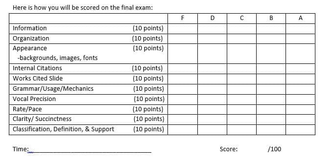 It’s clear that this prof is going for a holistic examination of your abilities alongside your public speaking skills:
This person wants to see that you know your stuff about your topic in addition to being a competent speaker:
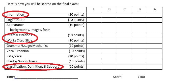 And the assessment of your skills, based on the class itself, is clearly outlined:
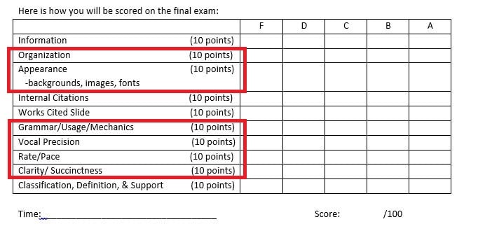 Other than not adequately preparing, there’s nothing stopping you from getting an A on this presentation.
You know exactly what’s being asked of you, and if you get started right away you have plenty of time to prepare.
Tip 3: Be Focused
You need to focus on your topic as much as possible—no sidebars or other distractions. You’ve got direct your listeners to the most important aspects of your topic. In a paper, this happens with words. In a presentation, this happens with images. Of course words are involved, but your slides will drive your information into the minds (and hearts!) of the listeners. Focus is always short hand for simple. So don’t do any of the following:- Overload the presentation with text or bullets
- Use images of low resolution
- Clutter the slide with graphics and charts that can’t be clearly seen
- Use short, clipped language
- Incorporate professional stock images
- Visually interpret small pieces of data
Tip #3: Be Intentional
Because the form of a presentation is mostly visual and minimalistic, space is paramount. You must use every inch of the frame wisely. Choose words that are placed on the slides with care, and think about how the audience will interpret what you’re saying as it relates to your visual aid. Map out what you want to say before you begin making the presentation, choosing your ideas carefully and thinking about how the audience will experience them.Tip 4: Be Modest
No one likes a showboat. And, sometimes, in an effort to compensate for what they feel they might lack, introverts may overcompensate accidentally. Be aware of this and adjust accordingly. Don’t do anything too out of the ordinary for yourself—simply be yourself. A few simple things will ensure that you nail this:- Dress casually, but nicely
- Memorize your material as much as possible
- Be a little bit self-deprecating
- Don’t apologize “for not being good at speaking”
- Time yourself before being in front of the audience
- Arrive 20 minutes early to get prepared
Design Moves 101
To get the job done right, you need to know a bit about design theory and how people experience information in a visual way. As well, you’ll need to understand how to manipulate tools in programs like PowerPoint so that you can make your presentation sleek and interesting. With the following simple techniques, you’ll be ready to take some risks you might not normally take.Tip 1: Customize Slides
To break the mold of what templates offer, you’re going to need to take some risks and manipulate your slides. This is less complicated than you think. Sometimes, you may have to format a slide to accommodate a strange design parameter, or you might want to set yourself apart from the other folks who will surely be relying on templates to make their presentations. Either way, be sure you format your slide before you add pics and text or you risk cramping the slide when it’s resized. To adjust the formatting, follow this simple set of commands: “File” > “Page Setup” > Enter your parameters in height and width and hit “OK” > Click “OK” again in the dialogue box > All done 🙂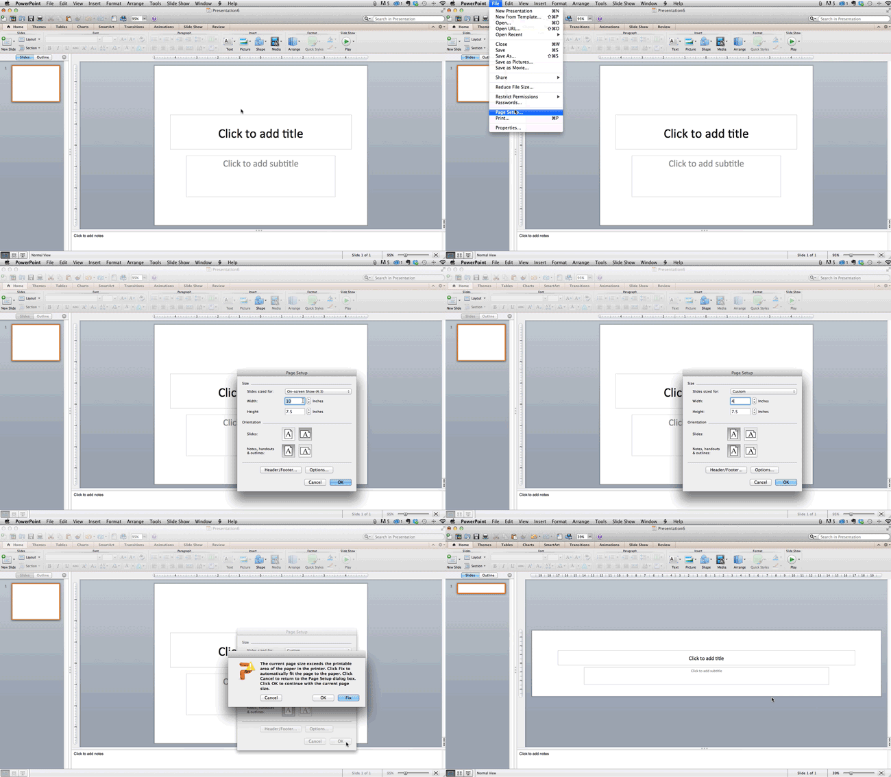
Tip 2: Edit a Template
Not keen on slinging something completely new? No problem! You can manipulate templates that already exist. You change colors and fonts, of course, but you can also change the way the material is presented. Do this: “Themes” > To the right, click “Edit Master” and then “Slide Master” > Manipulate the aspects of the slide you would like, click “Close Master” All done 🙂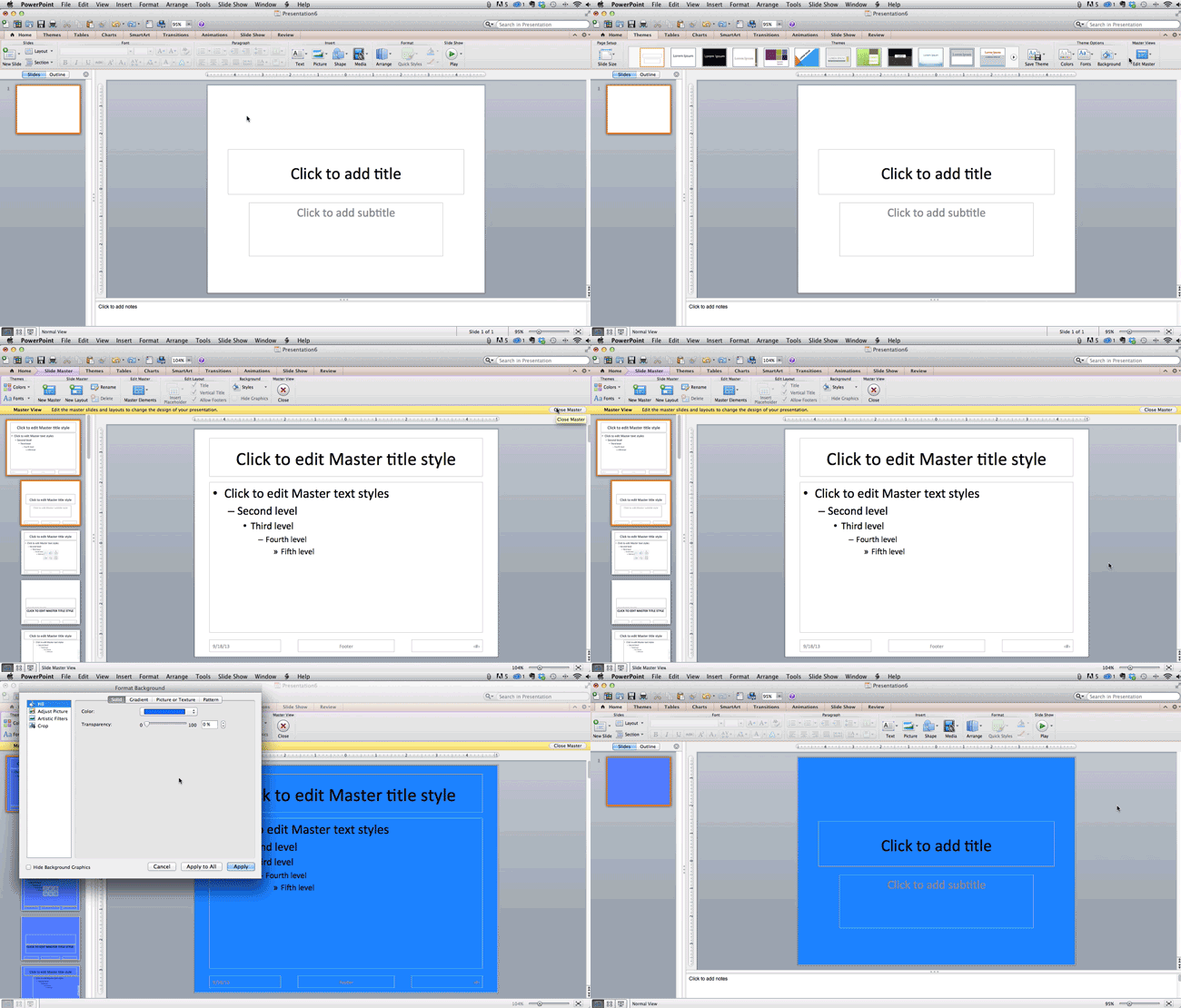 Now your presentation will reproduce new slides using this re-customized format. As well, if you’re feeling lazy, you can simply click the following hit “Variants” after selecting the “Theme” you want to use:
 Now you can ensure your presentation will look at least a bit more unique than others!
Tip 3: Align Objects
To keep a crafted, visually charming aesthetic, you’re going to need to align the shapes and materials on the slide. In a “Theme” this is simple—just a movement through drop/drag or resize. But if you’ve gone off on your own, you’ll need to do it manually. Here’s how: Hold down the “Shift” key (this technique works in all MS Suite tools!) > Hit “Arrange” and then “Align or Distribute” > Select “Align and Slide” > Select “Arrange” > Hit “Align and Distribute” > Select your preferred alignment. All done 🙂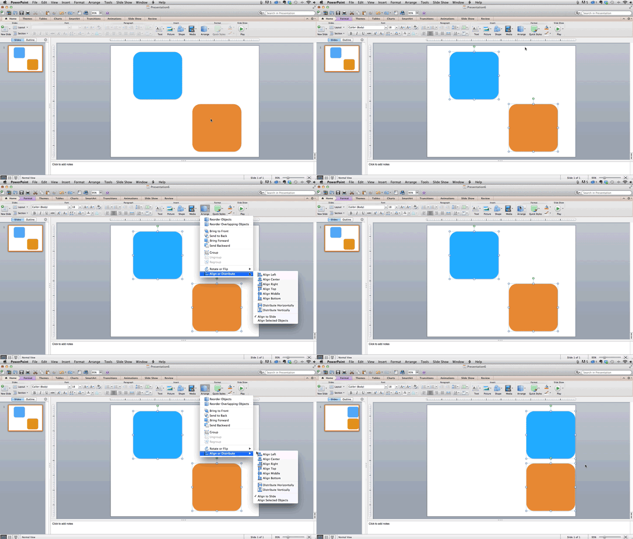
Tip 4: Be Consistent
No matter the subject or concept, being consistent about how you construct a presentation is paramount. To speak clearly and succinctly, to be direct, and to create a visually appealing presentation, you will need to pay attention to how you’re making your appeals. The key is to pay attention to transitions. Not only do you have to transition between ideas the same way you would in a paper (see our tremendous guide on this for your writing, like How to Write a Research Paper and Get an A+), but you’re going to have to help the reader move through the visual experience of your presentation. Yes, you can use a program’s slide transitions, but these are rote and cliché, especially when used for every slide. Better, you should think about how you can represent movement visually through pictures. For example, take a look at the FedEx logo… It’s ubiquitous, and you see it all the time, but did you know about it’s secret movement? Look: See the arrow? No? How about we circle it…
 FedEx is thinking cleverly. They’re embodying the meaning of their brand inside the logo itself.
But what does this have to do with making a presentation?
Simple… a visual language speaks volumes.
Imagine this: You’re giving your presentation, you tell a cheeky anecdote, and then you show this slide:
 Yeah, yeah, yeah… We all saw it coming.
Or, you could try something unexpected, like this:
 See how this is far more interesting and subtle? The road, the running kid, and the simple, sleek text are all leading to the next slide.
Images always augment meaning.
Along with that, be sure you’re representing data in an interesting and simple visual manner.
Check it—here’s a super cluttered, but very necessary piece of data:
 This amount of data is totally inadequate for a slide. While all of it is necessary and important, it is distracting an visually overwhelming.
Here is another piece of number-based data that is quite visually appealing:
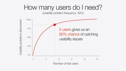 Ahhhh, much more smooth. Simple. Elegant, even.
Not how it directs the viewer’s attention to one data point in particular.
You can do this over the course of several slides—each one with a specific data point.
Again, less is always more!
Presentations Software and Add-ons
Beyond Prezi (which is now a pay to use program), PowerPoint, and Keynote is a world of fantastic software to help you accomplish your presentation goals of delivering crucial information with dynamic care. Here, we’re going to rundown a few of the freebies that can help you create a stunning presentation to wow your class or colleagues. If you’re feeling a bit shy about making a good presentation, let these programs take on some of the work for you. Here goes!1 / Canva
Based around the needs of marketing companies and sales-based pitches, this software is easy to use and provides several templates to meet your needs and whims. Everything is customizable and simple. As well, the software integrates with iPad, so you aren’t chained to a desk to complete your work!2 / Haiku Deck
 This application is available on tablets and the web and is a go-to for the marketing industry. It’s easy to create and share presentations as well as integrate with websites, so that’s an added bonus for more comprehensive group projects. It’s user-friendly, visually appealing, and beautifully original.
3 / SlideShare
Popular in the PR world, this program allows you to share presentations and distribute your work across multiple platforms, like blogs, social media outlets, and websites.4 / SlideDog
This program lets users move seamlessly between different kinds of presentation platforms, like PDF, PowerPoint, Keynote, Prezi, and other web-based programs. It’s a great too for people working collaboratively in groups, especially when people in those groups have different program preferences.5 / Projeqt
Despite it’s complicated brand spelling, this software emphasizes compatibility with internet-based materials like feeds, shortcuts, and favorites. Using it, you can embed your presentation on a website, connect to other presentations, and interface with multiple devices.6 / Oomfo
This brilliant little piece of magic allows you to create interactive presentations and charts with simple, user-friendly tools. It can integrate multiple data points from files, data, cloud apps, and other specialized data sorting material. If you have a data-heavy presentation to give, this is a must.7 / Slide Bureau
This slide creation program allows you to tailor your presentation to particular professions by offering you a variety of aesthetically pleasing, themed designs. Use across platforms is dynamic and simple. So that’s it! You’re all ready to go! Get creating!Online College Resources
Helping you prepare and gain the most out of your educational experience.
